
Have you ever wondered why websites look different on different computers? Or between different web browsers on the same computer? Basically, a website is just a set of instructions for what appears on your screen. The browser reads the instructions and outputs it to your screen. Each browser will take this information and process it a little differently, giving you different results. It’s similar to baking. You can give the same instructions and ingredients to five different people, and the end result will be five similar but ever-so-slightly different products. Here, we will discuss a few of the reasons for these inconsistencies.
Operating System and Browser Default Settings
Common “default” website elements display differently depending on operating system . HTML elements such as buttons, check boxes, error messages, etc. are often styled in a default way at the browser or operating system level. For example, on a PC, submit buttons appear square and flat, while on a Mac, they look like shaded ovals with a gradient. There are ways around this, however, by creating custom buttons to ensure a uniform look on all browsers.
Fonts are rendered differently depending on the browser and operating system. When coding a website, developers code the site with a range of back-up fonts to use if the original font isn’t available. Here is an example of how different browsers display different fonts:
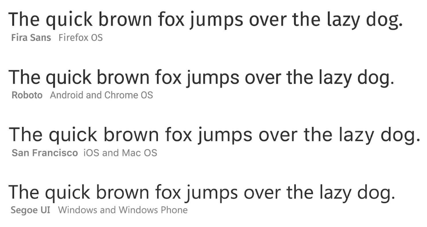
(Source)
Some Inconsistencies are Unavoidable
Despite a developer’s best efforts, there will always be inconsistencies between browsers and operating systems. However, the key is to keep these inconsistencies minor through browser compatibility testing. Browser Shots is a fast and free way to see how your website is rendering on multiple browsers. It’s also worth mentioning that when it comes to websites, often times, less is more. When you keep the extra bells-and-whistles to a minimum, there are fewer opportunities for the website to look and act differently. Not to mention, everyone likes an easy-to-navigate website with a clean, sleek design.
Google Analytics allows you to see the breakdown of what browsers your visitors use to view your site. This is a very helpful tool to determine which browsers to focus on, and which are irrelevant. If 99% of your traffic views your website on Chrome and Safari, don’t spend all of your energy trying to get things to layout just right on Firefox. Also, keep in mind if your visitors are using an outdated version of their browser, it’s likely that your site may not display properly.
User Settings
Your website’s appearance is also dependent on your visitor’s user settings. Screen resolutions, color settings, font sizes, and monitor calibration all affect the way your website looks on a computer, and unfortunately, there’s nothing that you can do to control them.
The most common screen resolutions are 1366 x 768 and 1920 x 1080. Some older computers may still have a lower resolution of 800 x 600. If someone is looking at a standard website on a lower resolution monitor, it will cause the site to appear huge and you’ll have to do a lot of scrolling left to right to see everything. By comparison, if someone’s resolution is very high, everything will be smaller, with extra space in the margins. There is no way to control the screen resolution of your audience. The best you can do is design your website to look good on the majority of computers out there. For example, designing a site with a 1024 pixel wide main container means the site will look good on roughly 94% of computers.
Next Steps
Now that the question “Why do websites look different on different computers?” is no longer a mystery, what’s next? Find out what the majority of your customers are using and start testing there. As the saying goes, you can’t please all the people all of the time, but you can please some of the people some of the time. Determine the top browsers you want to focus on and do your browser testing there. If someone is running an old version of IE on Windows 95 on a 20 year old computer, you’ll have to accept the fact that there will be functional and aesthetic value lost, and try not to lose sleep over it.
The developers at Blindspot Advisors are experts in browser compatibility testing. We can help you with your site, whether it’s an existing site or building from the ground up. Contact us today to get started!